
Although there's no innovation with the actual box itself the design printed on it makes up for it with it's hugely vibrant and full design. There's no blank space on the box, and this proves to be effective in how eye-catching the package is. The design if of a takeaway box and thus wants to reinforce to the customer how good the place they just left was in the hopes of repeat custom, this is done by the vibrant and magical world envisioned on this box,

It's important to keep brand identity clear across multiple products and designs, as shown here. The work is for a 'gentleman's barber shop' the colours chosen are all very warm but strong and rich colours, White, black and bronze. This gives a sense of validity to the business to make it feel as though they've been around for a long time. All the designs are simple yet effective due to the cohesive nature and muted colours.

Here the design is for cookies aimed at children, It's supposed to be fun and inviting. What makes these designs interesting and unique is the how the cookies on the flaps that open are crumbling the more you open it, This is a great way for using parts of the box most designers ignore resulting in a more effective design.

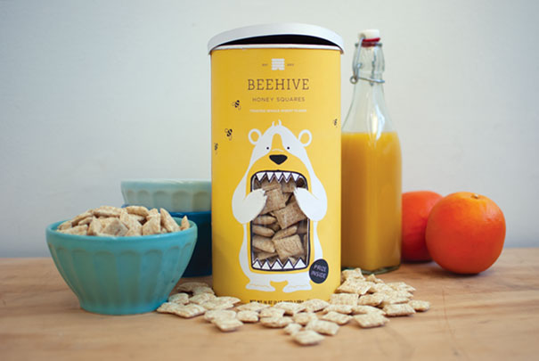
I think that packages that incorporate their products into the design are a great way of showing off the product and can also create a fantastic design. I really like how the bears mouth is showing the cereal the way they did this makes it cohesive and smooth with the rest of the design, It's eye catching and also gives a small narrative to the product, this and the stylised nature of the design, makes it appeal to children but still to adults because it keeps a minimalistic and mature feel to it.

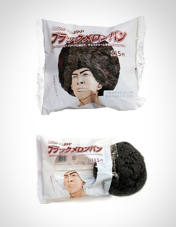
As with the previous design this also uses holes in the packaging to incorporate the product into the design. This is a good way of displaying the product in a fun and appealing manner. The creative way of the cake/biscuit becoming the characters afro means this doesn't detract from the design; although because I cant understand the text I don't know how relevant the design is. Though this shouldn't matter too much due to how creative and refreshing the packaging is.

The packaging design here values practicality the most. Having the information come highest priority with the colour of each paint pot filling out the rest of the design. This results in a simple, effective and easy to understand design.
.jpg)
This is gift wrapping paper but with a very unique twist, It's meat. So although not technically packaging design it's still creative and unique, and also relates heavily to possibilities for when it comes to the designs I will create. The idea of using two completely unrelated objects/ideas to come together and make such an interesting product.

This is an interesting, yet effective take on the boxes for when your moving house, it's clear practicality was also precedent with this design, with the top of the box having space for the address and also saying what room the contents belong in. The design is clean, but has a happy feel to it due to the vibrant blue and the smoothness of the blobs.

Here the product also ties in with the packaging, the grass, soil and roots all show you how the wooden kitchen utensils started out. Bringing the product to live, it also implies sustainability, not only in the product lasting long but as a green friendly product. The design also has a very personable feel to it because of the unique design.

The package here is hugely innovating and creative, the design on the packaging itself is simple and plain, This is because what makes it great is how the inside of the box is designed, made to push the spaghetti into the shape of the Empire State building, enforcing how it's local, New York spaghetti.