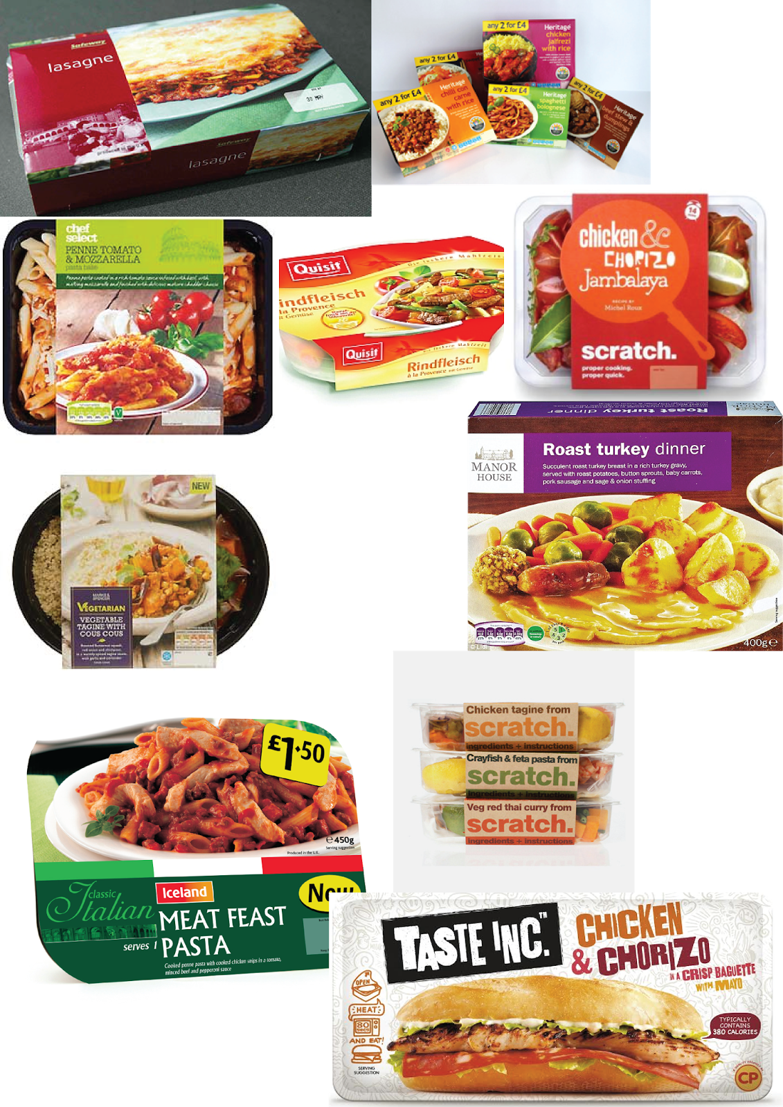
Here are some ready meal packaging as that is the brief I have chosen, Most of them have a clean, professional look while a few have a more rustic, organic and healthy look to them. They all share in common the images of the food contained with mostly vibrant colours to attract attention. Once they have the attention of the shopper the image of the food itself is then meant to make the potential customer become a customer.
-
Here is a ready meal brand that stood out to me while doing my research, scratch. I like the basic illustrated but also heavily typographic style, relying on colours and basic shapes to attract the attention of a customer, then the food itself is visible without having to have a photograph plastered across the design.


You can clearly see the brand through all of the ready meals, they are also all distinguishable at a glance due to the strong use of contrasting colours and easily read text. I feel this design suits the more healthy and homemade feeling these ready meals are trying to portray. The predominant style of text with coloured background and photograph of the food seemed to come mainly from big companies and gives out the feeling of mass produced in my opinion.

^ Side view also showing the clear and cohesive brand unity while showing how easy they are to identify from each other.
Another brand that stood out to me was Taste Inc. although they go with the almost stock picture of food design I said I didn't like. The way they use it and blend it with the rest of the packaging works well and is very appealing to the eye. It also has a more homemade, friendly feel too it; I would say this is due to the uneven text and rough edges. This gives of an atmosphere of humanity about it rather then a replicated printing process. The pattern in the background gives a lot to the design in the form of tying the design together and giving an interesting aesthetic.

