Friday, 12 December 2014
Product - Folding
There were two ways I could fold it, on the left was lightly scoured so the fold looks more like a bend and the right was almost cut, but no so much that it could teat. This one gave a more right angle fold.
This mattered to me because of what I wanted to project with the packaging, which is a friendly, simple but feel like it had been around for a while. With this I mind I felt the fold on the left worked better as It look more manmade and less mass produced then the very industrial right angle fold on the right.
This mattered to me because of what I wanted to project with the packaging, which is a friendly, simple but feel like it had been around for a while. With this I mind I felt the fold on the left worked better as It look more manmade and less mass produced then the very industrial right angle fold on the right.
Final Designs
Here are the final designs in net form, they are to be printed on a dark brown, 270gsm card, This is to achieve a friendly feel and brown is the most common colour in terms of pie packaging. A lot of barcodes now are mass printed by the companies stocking the food or whatever they're selling so I've placed guidelines for where it should be stuck to not damage the rest of the design and detract from main focal matter.
The design is meant to be clear, and have an impact in the simple but effective way it communicates the product to the consumer, A lot of packaging usually has pictures of the contained food but after speaking to various people who would be the target audience. I found a lot of them liked the aspect of not having that and rather have the simple communication. I wanted the packaging to look as though it has some prestige about it, it's not completely new, and I think the black on brown colour choice and the simplistic Celtic esq pattern benefits this aspect. This is because the feel of an old pattern that looks revamped to fit modern design makes you think the packaging / brand has been around for a while. I tried to fit patterns on the sides of the box and although it looked good, I really wanted to make it as clean as possible, and keep the philosophy. 'Less is more' for this, I feel this has paid off as the designs look great printed.
Thursday, 11 December 2014
Development
While experimenting I was trying to make a clean but bold design with the use of only a couple colours, Predominantly black on a card background.
Food information
All of the food information guidelines I found were pixellated slightly and too low quality to print so I reproduced my own one. In the end I didn't use all of it, only the actual information parts as I wanted a minimal and clean design so I wanted only information needed there.
Friday, 7 November 2014
Thursday, 9 October 2014
Ready Meal designs
Here are some ready meal packaging as that is the brief I have chosen, Most of them have a clean, professional look while a few have a more rustic, organic and healthy look to them. They all share in common the images of the food contained with mostly vibrant colours to attract attention. Once they have the attention of the shopper the image of the food itself is then meant to make the potential customer become a customer.
-
Here is a ready meal brand that stood out to me while doing my research, scratch. I like the basic illustrated but also heavily typographic style, relying on colours and basic shapes to attract the attention of a customer, then the food itself is visible without having to have a photograph plastered across the design.
You can clearly see the brand through all of the ready meals, they are also all distinguishable at a glance due to the strong use of contrasting colours and easily read text. I feel this design suits the more healthy and homemade feeling these ready meals are trying to portray. The predominant style of text with coloured background and photograph of the food seemed to come mainly from big companies and gives out the feeling of mass produced in my opinion.
^ Side view also showing the clear and cohesive brand unity while showing how easy they are to identify from each other.
Another brand that stood out to me was Taste Inc. although they go with the almost stock picture of food design I said I didn't like. The way they use it and blend it with the rest of the packaging works well and is very appealing to the eye. It also has a more homemade, friendly feel too it; I would say this is due to the uneven text and rough edges. This gives of an atmosphere of humanity about it rather then a replicated printing process. The pattern in the background gives a lot to the design in the form of tying the design together and giving an interesting aesthetic.
Friday, 26 September 2014
Friday, 12 September 2014
Surface Graphics for 3D Shapes - Bottle
For this task I was asked to design a wrap around label for a cylindrical packaging form, bottle, can, so on. I chose a bottle, and then a lager company, picking the name Man'Siguel.
^ Initial creation. The right part of the label complete and experimented with already, it came to the application of the text and legal parts on the left. They needed fixing, I found it didn't suite the friendly style and warm feeling that I wanted the design to inspire.
^ Re-sized and moved the legal requirements in the center around to give the more design heavy aspects of the label more breathing room and make more use of the negative space. Also added the Man'Siguel text to the leftmost part, to try make the whole label's design feel more coherent. Also added larger speech marks to the text to help with the friendly feel.
^Removed the speech marks because of how they ended up looking just tacked on and messed with the alignments and spacing of the text in the box too much. Added rough edges to the bottom and separating the bottom text from the top part, because they weren't a continuation. So there was no need to force all that black orange space in there that was doing nothing other then distracting the eye from the more essential parts of the design and packaging.
^ Two variations on the logoish(?) part of the packaging, I went with the one on the right in the end as I felt the left looked too much like it was just a 50/50 split of white and orange with no thought put into the colour placement. I also thought having too much orange around the name detracted from the importance of it in the design hierarchy. Although it had a warmer more welcoming feel, the two reasons meant I picked the right design,
Sunday, 31 August 2014
Packaging Design Research.


Although there's no innovation with the actual box itself the design printed on it makes up for it with it's hugely vibrant and full design. There's no blank space on the box, and this proves to be effective in how eye-catching the package is. The design if of a takeaway box and thus wants to reinforce to the customer how good the place they just left was in the hopes of repeat custom, this is done by the vibrant and magical world envisioned on this box,

It's important to keep brand identity clear across multiple products and designs, as shown here. The work is for a 'gentleman's barber shop' the colours chosen are all very warm but strong and rich colours, White, black and bronze. This gives a sense of validity to the business to make it feel as though they've been around for a long time. All the designs are simple yet effective due to the cohesive nature and muted colours.

Here the design is for cookies aimed at children, It's supposed to be fun and inviting. What makes these designs interesting and unique is the how the cookies on the flaps that open are crumbling the more you open it, This is a great way for using parts of the box most designers ignore resulting in a more effective design.

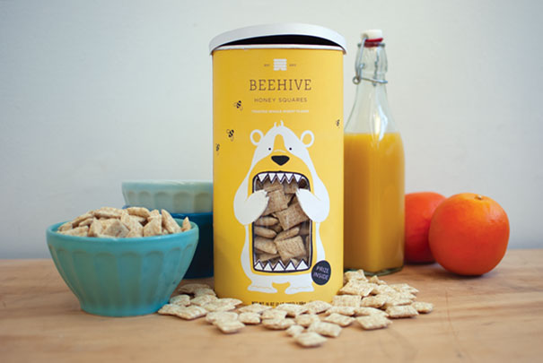
I think that packages that incorporate their products into the design are a great way of showing off the product and can also create a fantastic design. I really like how the bears mouth is showing the cereal the way they did this makes it cohesive and smooth with the rest of the design, It's eye catching and also gives a small narrative to the product, this and the stylised nature of the design, makes it appeal to children but still to adults because it keeps a minimalistic and mature feel to it.

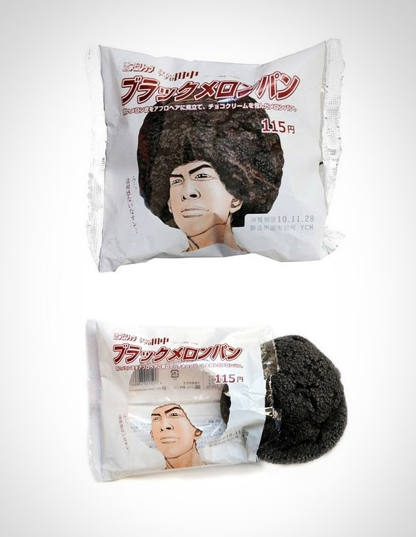
As with the previous design this also uses holes in the packaging to incorporate the product into the design. This is a good way of displaying the product in a fun and appealing manner. The creative way of the cake/biscuit becoming the characters afro means this doesn't detract from the design; although because I cant understand the text I don't know how relevant the design is. Though this shouldn't matter too much due to how creative and refreshing the packaging is.

The packaging design here values practicality the most. Having the information come highest priority with the colour of each paint pot filling out the rest of the design. This results in a simple, effective and easy to understand design.
.jpg)
This is gift wrapping paper but with a very unique twist, It's meat. So although not technically packaging design it's still creative and unique, and also relates heavily to possibilities for when it comes to the designs I will create. The idea of using two completely unrelated objects/ideas to come together and make such an interesting product.

This is an interesting, yet effective take on the boxes for when your moving house, it's clear practicality was also precedent with this design, with the top of the box having space for the address and also saying what room the contents belong in. The design is clean, but has a happy feel to it due to the vibrant blue and the smoothness of the blobs.

Here the product also ties in with the packaging, the grass, soil and roots all show you how the wooden kitchen utensils started out. Bringing the product to live, it also implies sustainability, not only in the product lasting long but as a green friendly product. The design also has a very personable feel to it because of the unique design.

The package here is hugely innovating and creative, the design on the packaging itself is simple and plain, This is because what makes it great is how the inside of the box is designed, made to push the spaghetti into the shape of the Empire State building, enforcing how it's local, New York spaghetti.
Subscribe to:
Posts (Atom)


.png)
.png)
.png)
.png)
.png)

